

2023年底,由於主持建築師設立自己的建築事務所,所以對Fa+P的品牌形象進行更新。這次的更新直接使用原本事務所的英文全名”FIELDSCAPE”作為Logomark的主軸,建立簡潔明快的形象。事務所名稱也改為”Architects+Associates”以反應公司結構的改變。
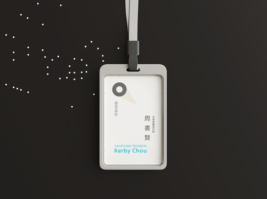
原本企業識別系統中的視覺元素「探照燈」與「透視空間框」保留,成為主要的兩個視覺元素,並應用在企業硬育的各方面。整體品牌的形象也朝更簡潔的形象改進,象徵更專業的公司形象。
At the end of 2023, due to the lead architect's establishment of their architectural firm, a rebranding initiative was undertaken for the Fa+P brand. The update directly incorporates the full English name of the firm, "FIELDSCAPE," as the focal point of the Logomark, establishing a clean and vibrant visual identity. The firm's name has also been changed to "Architects+Associates" to reflect the changes in the company's structure.
The visual elements of the original corporate identity system, namely the "searchlight" and "perspective spatial frame," are retained and become the two primary visual elements applied across various aspects of the corporate culture. The overall brand image is streamlined to represent a more professional company identity, emphasising simplicity and clarity.


FIELDSCAPE
Architects + Associates
周書賢建築事務所+預景設計有限公司企業識別
Fieldscape Architects + Associates
周書賢建築+預景設計
企業形象識別系統設計
2015、2024
Fieldscape Architects and Planners是由兩個設計事業體為主體的建築景觀事務所。因為這個特性,在構思建構品牌識別時,考慮如何能在一個系統當中表現出兩個不同實體的特性,並呈現空間設計的本質,讓觀者能很快地了解這個品牌的特色。
考慮有兩個不同業務內容的實體,希望這套CI能在共同元素中有所變化。我們從空間設計的本質中追尋,利用空間透視的原理,在一套格線系統之中能創造出無數相同規範的品牌元素。以透視框象徵建築設計、以探照燈光線代表景觀部分的『預景』的涵義。色彩計畫也以空間設計中常見的黑色、灰色(墨線)、藍色(藍圖)作為基礎修改。
Fieldscape Architects and Planners is an architectural landscape firm primarily composed of two design entities. Given this characteristic, when conceptualising the brand identity, the focus was on expressing the distinctive features of these two separate entities within a unified system while capturing the essence of spatial design to enable viewers to grasp the brand's uniqueness quickly.
Considering the existence of two distinct entities with different business contents, it was desired that this corporate identity (CI) could exhibit variations within shared elements. We delved into the essence of spatial design and employed the principles of perspective to create many standardised brand elements within a grid system. Using a perspective frame symbolises architectural design, while the spotlight rays represent the "prelude" of the landscape component. The colour scheme was modified based on common colours in spatial design, such as black, grey (ink lines), and blue (blueprints).


